 Tesseract
How an AI makes a real font, and a brand kit around it
How Tesseract turns a style prompt or your handwriting into an installable font, and one logo into a full brand kit: the pipeline, the checks, the kit.
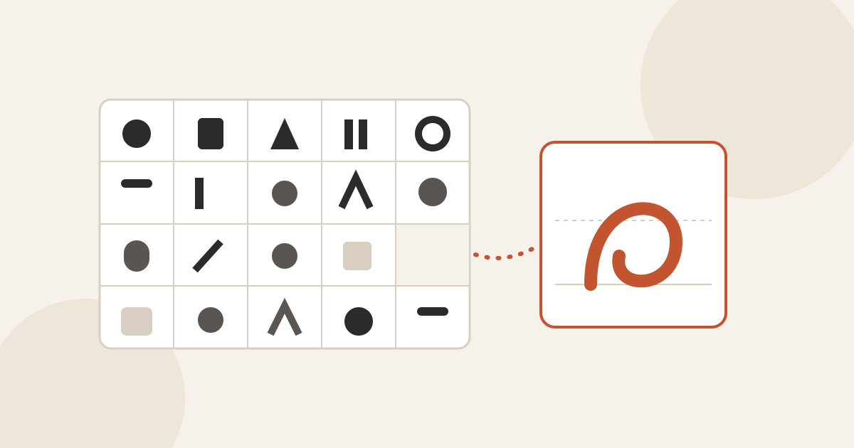
Tesseract makes a real, installable font from a style prompt or your handwriting. Letters are drawn into a fixed grid of template sheets, checked sheet by sheet, then traced, spaced, kerned and built into OTF, TTF and WOFF2 on your computer. Create a brand sets a logo’s name in real type and builds the kit around it without a model.
This post explains how both work: why a font needs a template rather than a free drawing, the checks that catch a model’s wrong letters, the steps that turn pictures of letters into a font that sets text properly, and how a brand kit is built from one logo.
Why can’t an image model just draw a font?
An image model can draw a beautiful alphabet. That picture is not a font. A font is a file in which every character has an outline, a width, side bearings (the space to its left and right), a position against the baseline, and pairs that need to sit closer together. A picture has none of those. And a model can draw the wrong letter, leave one out, stop halfway or drift from the style, which is exactly what the check described below looks for.
So the design question was not “how do we get a model to draw letters”. It was “how do we get letters out of a model in a form whose geometry we already know”. If we know exactly where each letter’s cell is, and where the baseline, the x-height and the cap height are inside that cell, then the metrics stop being a guess. The pixel row a stroke stands on maps straight to font units.
How does Tesseract turn a prompt into a font?
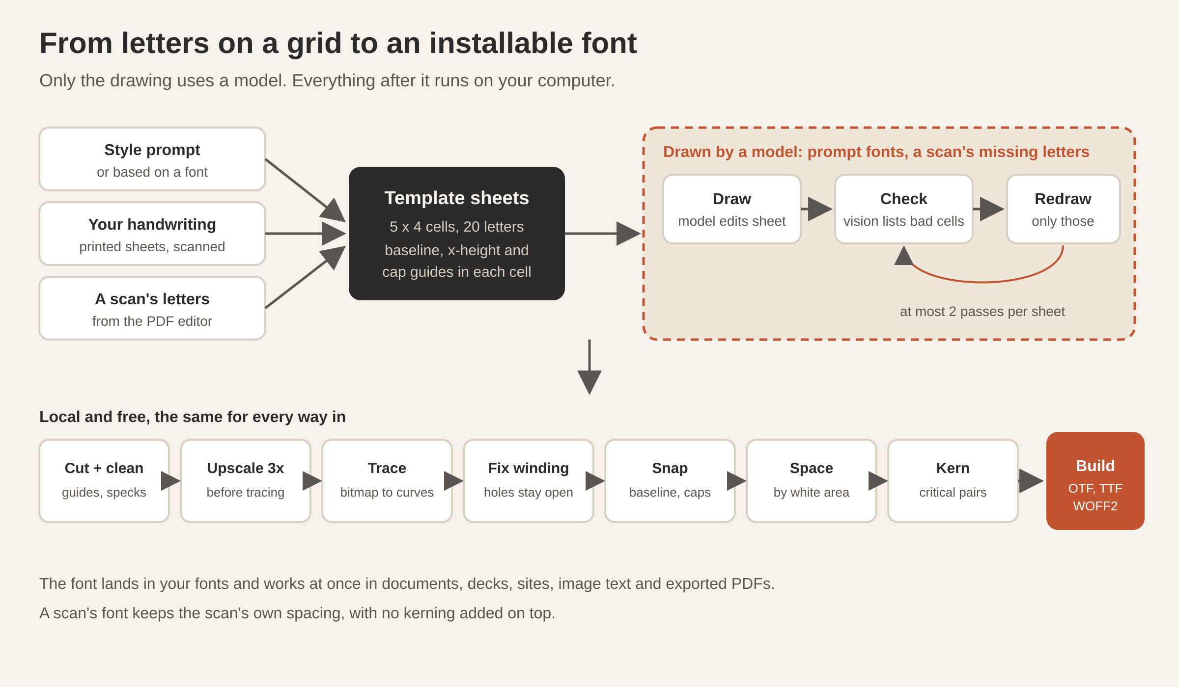
Everything starts from a template sheet: a 1536 × 1024 image with a margin of registration squares and a grid of 5 × 4 cells, 20 characters per sheet. Each cell has a strip at the top for the character’s label, and guide lines for the baseline, x-height and cap height.
Fonts cover script packs you choose: Latin (A to Z, digits and punctuation, 87 characters), Romanian diacritics, Western European accents, Cyrillic and Greek. The default follows your system language. Romanian uses the correct comma-below letters (Ș ș Ț ț), not the legacy cedilla code points. The Latin pack alone fills five sheets.
On the AI path, each empty template is sent to the image model you have set up for image editing, with a prompt that describes the style and the characters for that sheet. Because the model edits the template rather than drawing on a blank canvas, the grid survives, and the cells stay where we expect them.
You can also base a font on an existing one. The app renders a specimen of the family you pick, a vision model describes its look in a designer’s words, and that description is folded into the prompt. The result is an original font in the same spirit, not a copy.
How does it catch a model’s wrong letters?
Every AI sheet goes through a vision check before it is accepted. A reviewer model sees the sheet, the characters it should hold and the style, and lists the cells that are wrong, missing, incomplete or off-style, with one short instruction for the fix.
Then only those cells are redrawn. The app builds a mask that keeps every good cell and opens only the flagged ones, and asks the image model to redraw just those characters in the style of the rest of the sheet. This is cheaper than drawing the sheet again, and it cannot disturb letters that were already right. With a model that takes no mask, the whole sheet is drawn again with the list of cells to redo. Each sheet gets at most two passes.
Each sheet is one image-model call plus its checks. Everything after the drawing is local and free.
How do pictures of letters become a font?
Once the sheets exist, the rest happens on your computer, with no model involved:
- Cut out and clean. Each cell is cut out by the known grid. Guide lines that the model traced into its letters are removed, and a connected-component filter drops specks.
- Upscale before tracing. Each cell is enlarged three times before it is traced. Tracing a small bitmap gives blobby outlines; tracing a large one gives clean curves.
- Trace. An open-source bitmap tracer, compiled to WebAssembly, turns each letter into curves, with a pure JavaScript tracer as a fallback.
- Fix the winding. Tracers write holes in any direction. Fonts fill with the non-zero rule, so a hole has to wind opposite to the shape around it, or the inside of o, e and D fills in solid. Each contour is classified by its signed area and how deeply it is nested, and turned the right way.
- Snap and renormalize. Each glyph is snapped to the baseline, and the cap height is renormalized across the whole font, so letters drawn on different sheets end up the same size.
- Space. Side bearings are set by area, the core idea of the HT Letterspacer method: for each side, measure the average white depth between the outline and its outermost point inside a measuring window, then choose the bearing that hits a target. Lowercase is measured in the x-height zone, capitals and digits in the cap zone. Straight stems such as n and H land at about 45 to 50 units on a 1,000-unit em.
- Kern. Critical pairs are kerned by their countershapes. For a pair like AV, To, Yo or r followed by a full stop, the white gap on the right of the first letter and on the left of the second is measured over their shared band; where the sum is larger than the target, the pair is pulled together. Only pairs over a threshold are kept, so the table stays small.
- Build. The glyphs are assembled into an OTF and converted to TTF and WOFF2. Kerning is written as a classic kern table, which the app’s browser engine honours both for web fonts and in exported PDFs.
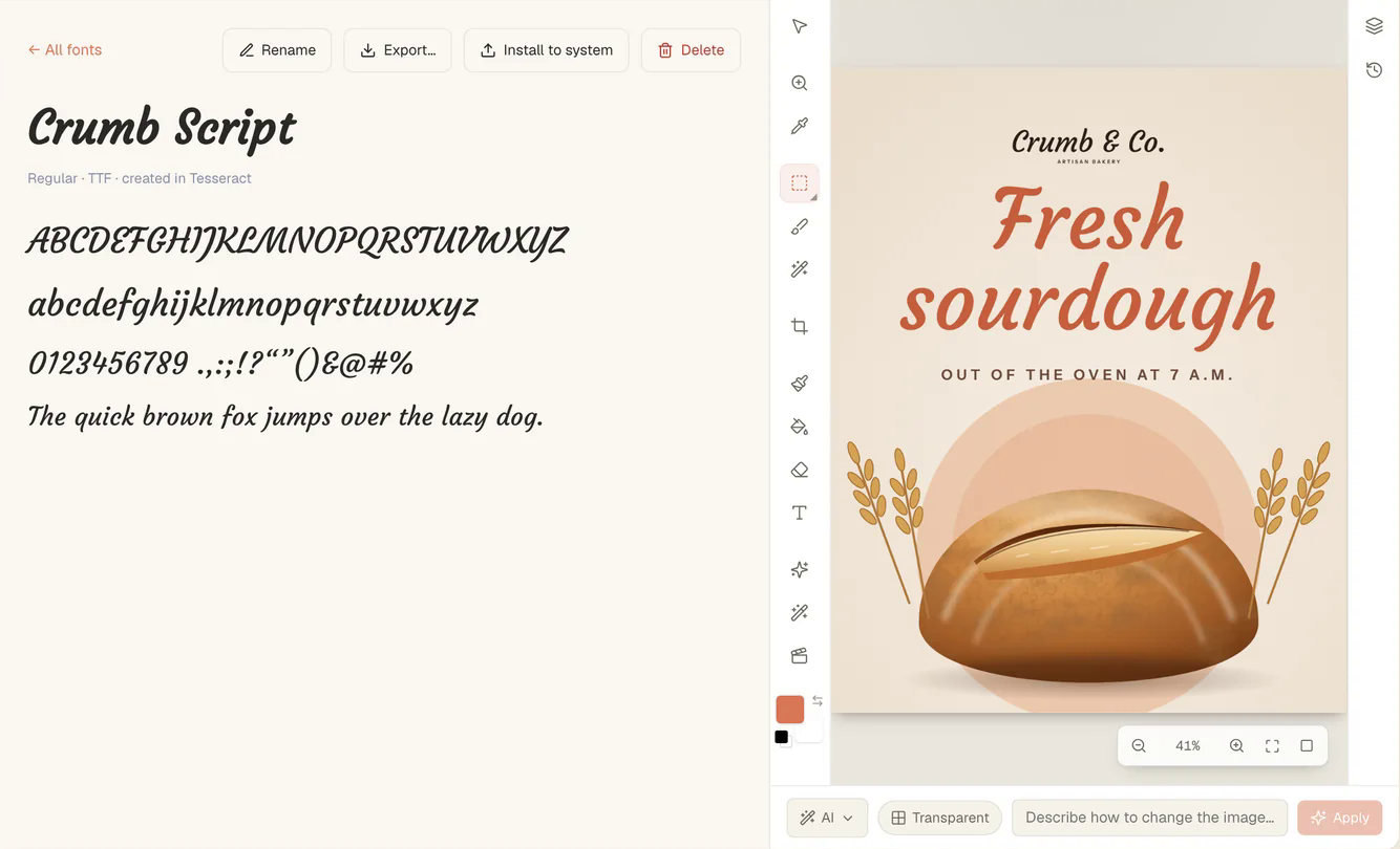
The finished font goes straight into your fonts and works everywhere in the app at once: the document editor, decks and sites, text in images, and exported PDFs. From its page you can rename it, export it, install it to your system or delete it. The whole run takes a couple of minutes. Every font is tested for distinct glyphs and for legibility at small sizes, so it reads as well at 12 pixels as at 200.
How do you make a font from your handwriting?
The handwriting path uses the same sheets, without a model.
- Choose the script packs, then Save blank template sheets to a folder.
- Write each letter in its box, by printing the sheets or by drawing on them on a tablet.
- Scan or photograph the filled sheets, keeping the grid, guide lines and labels intact.
- Build from filled sheets, choosing the images in order.
From there it is steps 1 to 8 above. Since there is no drawing step and no check, a handwriting font costs nothing to make.
There is a third way in that you may never notice. When the PDF editor makes a scanned page editable and no installed font matches the scan, it makes a font from the scan’s own letters. Each letter the scan shows is scaled to the template’s x-height and set on its cell’s baseline; the letters the scan does not show are drawn by the image model in the style of the ones already there. The font keeps the scan’s own spacing, with no kerning added on top, so words set in it look the way the scan did.
You can also simply import a font file (.ttf, .otf, .woff or .woff2), or browse about 300 open-source families that come with the app and install any of them to your system.
How does Create a brand make a logo?
Logos are made in the guided Create a brand maker. It asks about the business first: what it is called and what it does. Then it asks only what that left open, each with a “You choose” option: the name (or suggestions, or a symbol alone), what the business does, the kind of logo, the feel and the colours. It turns that into six ideas in plain words, and “Make 6 logos” draws them.
Each logo has two parts made in two different ways:
- The symbol is drawn by the image model and traced to a vector.
- The name is set in real type, as outlines taken from a font file. It is not drawn by a model, so it is always spelled right, and it shows at once while the symbol is still being drawn.
The typefaces come grouped by feel (modern, bold, elegant, friendly, techy, classic), chosen for logos: strong at small sizes, distinct letterforms and a range of weights. All are open-licence fonts under the SIL Open Font License. Setting the name fetches the typeface from the internet.
Once you pick a logo, its layout, typeface, colours and tagline change instantly and for free, because none of them needs a new drawing. Only the symbol changes by asking. Layouts are the symbol beside the name, above it, a round badge with the name set around the ring, the name alone, or the symbol alone.
The proportions follow how logo designers set lockups. The symbol is twice the height of the name’s capitals beside it and 2.3 times above it; the gap is half a capital; clear space is 0.7 of a capital all round. The name is centred on its capitals, not its descenders, and aligned by its ink rather than its advance width. It is laid out glyph by glyph (advance, kerning, tracking), and each TrueType glyph is outlined from its own points, which matches what the browser draws.
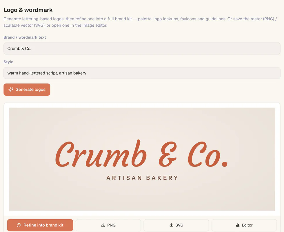
The maker can also draw the name itself as lettering, as an alternative to the six ideas.
What is in the brand kit, and why is it not made by a model?
When you save, you get the logo in every version and size, an app icon and favicons, the font files, a one-page guide and a BRAND.md file, copied as they are to a folder you choose. Around the logo the kit adds a palette with a job for each colour (primary, secondary, accent, ink, paper, tint, deep, and the colour for text on the primary), a typeface for body text beside the logo’s, social media covers and an avatar, and a business card.
The versions of the logo are full colour, on dark, one colour black and white, on the brand colour, the symbol alone and the app icon.
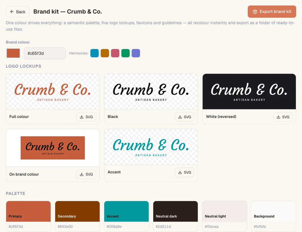
Nothing in the kit is generated by a model. Every piece is computed from the logo as designed: its colours, its typeface’s feel and its lockups. Colours are derived from the brand colour as harmonies, tints and shades. Change the logo and the kit is made again the same way, instantly, with the same result every time.
That is the trick of the whole maker. The expensive, unpredictable step (drawing a symbol) happens once. Everything a business needs around it is ordinary, deterministic code, so it can be changed as often as you like without waiting for a model or paying for a call.
The kit also includes an editable logo: a vector drawing in which the symbol is paths and the name and tagline are live text in their typeface, with the font files carried beside it. You can retype the name and it keeps its typeface, weight, spacing and colour. Its exports to SVG, PNG and PDF turn the text into outlines, so they never depend on a font being installed.
Questions
Can I make a font from my own handwriting? Yes. Save the blank template sheets, write each letter in its box, scan or photograph the sheets, and build. No model is involved, so it costs nothing.
Is the font a real file I can use in other apps? Yes. It is built as OTF, TTF and WOFF2. You can install it to your system or export it, and it works across Tesseract at once.
Will the logo spell my business name correctly? Yes. The name is set from a real font file, not drawn by an image model. Only the symbol is drawn.
What do I get when I save a brand? Every logo version as SVG and PNG, an app icon and favicons, the font files, a palette with each colour’s job, social covers, a business card, a one-page guide, BRAND.md and an editable logo.
Is changing colours or layout free? Yes. Layout, typeface, colours and tagline change instantly without a new drawing; the kit is rebuilt by code from the logo.
For a walk through the maker from the user’s side, see every card on Home opens a guided maker. The same image tools work on every framework, as everything the agent can do on every framework shows, and what Tesseract makes lists the rest.
Download Tesseract and open Fonts to make one from your own handwriting.